Zurb Foundation Elements
FoundationFramework have ton of elements to help you build responsive site without worry about your baseline. In this section we learn about some important foundation elements.
Typography
Typography make easy to fine-tune your type across different breakpoints. Normally we use following typography elements
- Blockquotes
- V-cards
- Links
- Lists
- Header and small tag
Click here to read full tutorial.
Example Labels
Regular Label
Radius Secondary Label
Round Alert Label
Warning Label
Success Label
Success Label
Buttons
Foundation Framework allows you to customize or override button styles based on your needs. Foundation classifies buttons based on size attributes color, size and radius. Size class contains .tiny, .small, .medium and .large. Color class contains .secondary, .alert and .success.
Click here to read full tutorial.
Sample Buttons
Tiny Button Alert Button Radius Button Disabled Button Expanded Button
Navigation
Navigation in Foundation Framework includes pagination, Side nav, Sub nav, Top bar and Breadcrumbs. Pagination is moving between pages with the advent of longer pages. It can useful for long, repititive content. Side nav, like you will see on our main site, is useful for sections of either a site or a page. Sub nav used to move between different states of pages. Breadcrumbs shows navigation trail for user clicking through site. Top bar is used for complex navigation between pages.
Click here to read full tutorial.
Off-canvas Output
Grid System
Foundation grid increased and decreased based on the browser width. Bootstrap has set of pre-defined grid sizes for screens and main devices. It will suddenly change the grid size while you resizing the browser width. Foundation will adapt its grid to the current browser. Both grid systems have all of the advanced features such as nesting, offsets and pushing/pulling. Bootstrap grid use 12 columns making for a 940 px wide container without responsive. If responsive feature added, the grid adapts to be 724 px and 1170 px wide based on view port. The zurb foundation grid specify width each column with the small, medium and large.
Orbit Slider
Orbit slider is used for creating responsive image or content slider with easy and efficient manner. By using orbit, the user can swipe on touch enabled devices. It use foundation.orbit javascript file. If you need to use orbit element to your website, you will add following codes only.
Form
By using Foundation Form, we can create easy and effective form layout.
Click here to read full tutorial.
Sample Forms
Callouts & Prompts
Foundation Framework provides Reveal Model, Alert Box, Panel, Tooltips, and Joyride by using CSS.
Click here to read full tutorial.
Click this Reveal Link
Reveal Modal
It is Reveal Model???
Awesome. It is work well???
Reveals Model creates pop-up windows using jQuery plugins
×Contents
Foundation Framework provides Dropdown, Pricing Tables, Progress Bars, Tables, Accordion, Tab and Equalizer by using Javascript.
Click here to read full tutorial.
Pricing Table Example
- City
- $1999.99
- Everything Covered
- 1 Guide
- VIP Room
- 50% Discount Food
Media
In Media section, Foundation Framework provides Orbit Slider, Thumbnails, Clearing Lightbox and Flex video.
Click here to read full tutorial.
Orbit Slider Example


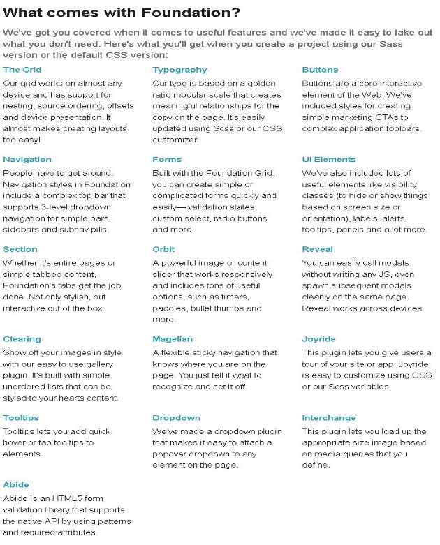
A short explanation of the elements provided by Foundation 4 is present in the below image, click the image to visit Zurb Foundation documents.