
Step 1 - Responsive Web Design - Step by Step Example
<< IndexHeaders - Step 1.1
This is what we are going to create in this step by step tutorial. Click on the image to visit the example website. Try restoring the browser window to see what happens, only the header of the webpage will automatically respond to the size of your browser window. The rest of the webpage is not yet responsive.
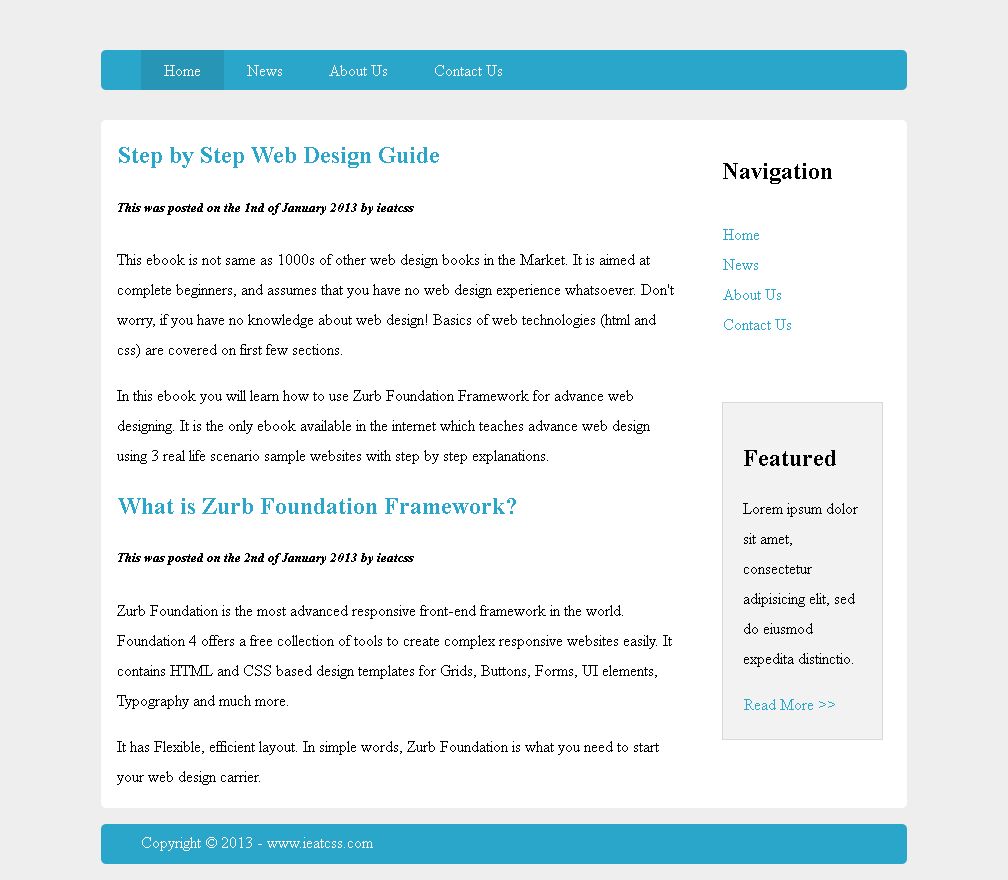
In Step 1.1, CSS3 style is applied to the "nav" bar. style will be applied to the links in the later steps.
The style is provided below with HTML comment explanation.
/* Navavigation Bar */

.pageHeader nav {
	background: #2BA6CB;  /* Sets light blue background */
	height: 160px;  /* Changes the height to 160px; */
	line-height: 30px;  /* It makes the links to appear in the middle */
	margin-bottom: 0;
}
Headers - Step 1.2
In Step 1.2, CSS3 style is applied to the links inside nav bar.
The style is provided below with HTML comment explanation.
.pageHeader nav ul {
	list-style: none;
	margin: 0 auto;
	padding-left: 0;
}

.pageHeader nav li {
	margin-left: 0 auto;
	width: 100%;
}

.pageHeader nav a:link, .pageHeader nav a:visited {
	color: #FFF;
	display: block;  /* Changes the link styles from inline to block */
	height: 30px;
	padding: 5px 0;
	text-decoration: none;
}
Header Step is now complete.
Step 2 >>