Creating Pure Template
This is what we are going to create in this step by step tutorial. Click on the image to view the website in new tab.
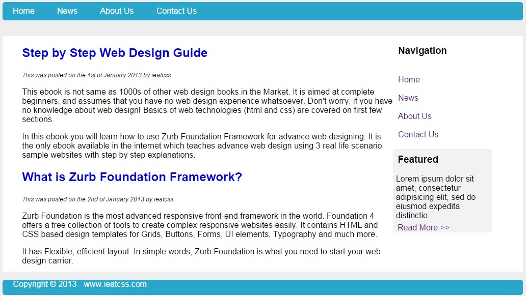
Steps to create the above website.
Step 1: Creating Navbar using navbar element.
<div class="pure-menu pure-menu-open pure-menu-horizontal" style="background-color: #2BA6CB; border-radius: 5px;">
    <ul>
        <li class="pure-menu-selected"><a href="#" style="color:white;">Home</a></li>
        <li><a href="#" style="color:white;">News</a></li>
        <li><a href="#" style="color:white;">About Us</a></li>
        <li><a href="#" style="color:white;">Contact Us</a></li>
    </ul>
	</div>
Step 2: Creating body content using below code.
<div style="background-color:white; margin-top:3%;">
	<div style="width:75%; float:left;">
	<article style="padding-left:5%;">
    <header><h2><a href="#" style="text-decoration:none;">Step by Step Web Design Guide</a></h2></header>
	<footer><i style="font-size:12px;">This was posted on the 1st of January 2013 by ieatcss</i></footer>
	<content>
    	<p>This ebook is not same as 1000s of other web design books in the Market. It is aimed at complete beginners, and assumes that you have no web design experience whatsoever. Don't worry, if you have no knowledge about web design! Basics of web technologies (html and css) are covered on first few sections.</p>
        <p>In this ebook you will learn how to use Zurb Foundation Framework for advance web designing. It is the only ebook available in the internet which teaches advance web design using 3 real life scenario sample websites with step by step explanations.</p>
    </content>
	</article>

	<article style="padding-left:5%;">
	<header><h2><a href="#" style="text-decoration:none;">What is Zurb Foundation Framework?</a></h2></header>
	<footer><i style="font-size:12px;">This was posted on the 2nd of January 2013 by ieatcss</i></footer>
	<content>
	  <p>Zurb Foundation is the most advanced responsive front-end framework in the world.  Foundation 4 offers a free collection of tools to create complex responsive websites easily.  It contains HTML and CSS based design templates for Grids, Buttons, Forms, UI elements, Typography and much more.</p>
      <p>It has Flexible, efficient layout. In simple words, Zurb Foundation is what you need to start your web design carrier.</p>
	</content>
	</article></div>
Step 3: Adding Sidebar which provides feature panel and navigation links using below code.
<div style="float:left; width:20%;">
    <aside>
	  <h3 style="padding-left:5%;">Navigation</h3>
	  <ul class="navigation" style="list-style-type:none; padding-left:5%;">
	  <br />
	  <li><a href="" style="text-decoration:none;">Home</a></li>
	  <br />
	  <li><a href="" style="text-decoration:none;">News</a></li>
	  <br />
	  <li><a href="" style="text-decoration:none;">About Us</a></li>
	  <br />
	  <li><a href="" style="text-decoration:none;">Contact Us</a></li>
	  </ul>
	 </aside>

  	 <aside style="padding-right:5%;`">
		<div style="background-color:#F2F2F2;">
		<h3 style="padding-left:5%; padding-top:5%;">Featured</h3>
		<p style="margin:3%;">Lorem ipsum dolor sit amet, consectetur adipisicing elit, sed do eiusmod expedita distinctio.</p>
		<a href="" style="text-decoration:none; padding-left:5%;">Read More >></a>
		</div>
     </aside></div>
Step 4: Creating footer with navlist style class using below code.
<footer style="background-color: #2BA6CB; border-radius: 5px; height:30px; text-align:justify; padding-left:2%;"> <p style="color:white;">Copyright © 2013 - www.ieatcss.com</p> </footer>
Step 5: Save the file and open it in your favorite browser, the web page will now look like,
